Travel illustrations
Before rebranding, Omio had different brand guidelines... I made two of the following projects using the old ones.
In collaboration with product designers, I did some illustrations that would be integrated in the app's flow. The following are the kinds of travellers we could find between our users.


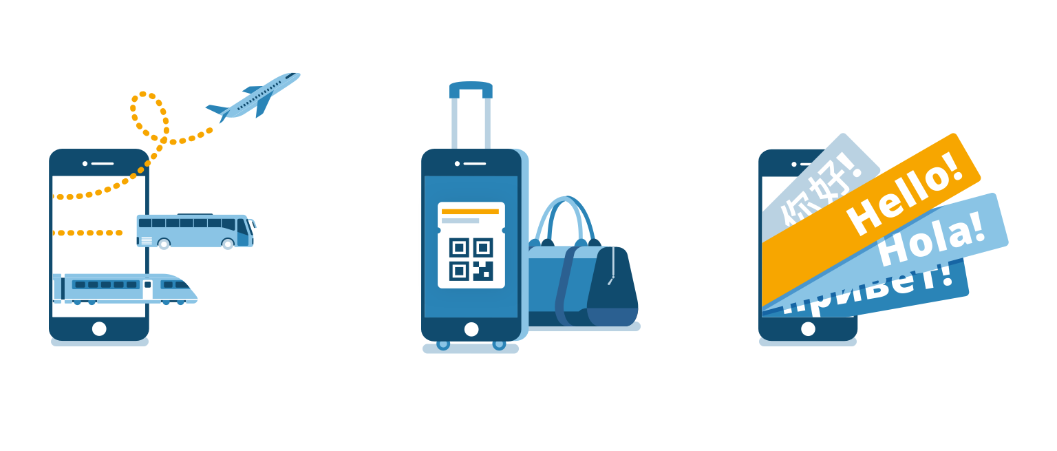
For the next project I worked with the product department. When installing the app for first time, the user would see the onboarding screens. These, consisted in some unique selling points of the app. With these three illustrations I tried to explain the text.
The same concepts were used after rebranding, proving their good quality.
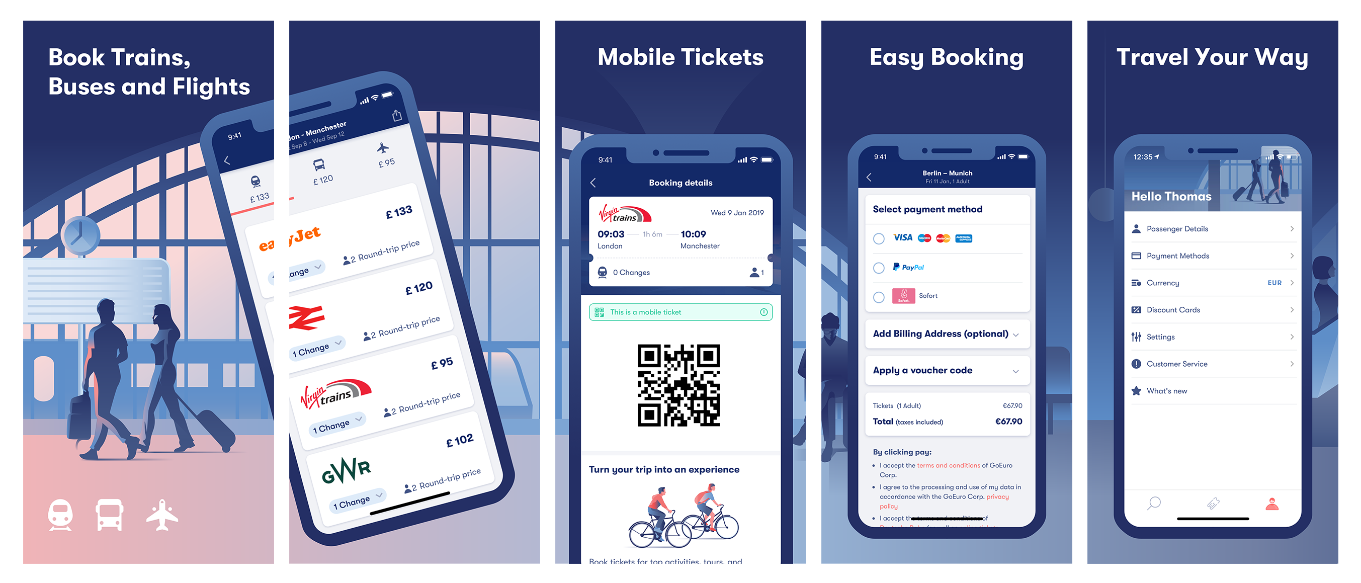
One of my tasks was to create and update all graphic material for Omio’s App Store profile. A big chunk of it were the screenshots used to showcase the App.
We wanted to show all the process and features. For that, I needed to run the App’s code with my computer and retrieve all the screenshots in all the different languages. The hardest part was to purchase fake tickets. During this process I was constantly talking to product designers and developers pointing out inconsistencies and bugs. Was a big effort but it really helped us find mistakes and improve the whole experience.